Employee Productivity Metrics: How to Measure and Track Performance
Employee productivity metrics measure output and impact, not just hours logged. This guide lays out a five-step framework for measuring productivity at scale, and shows how agentic intelligence turns siloed data into real-time alerts on burnout, attrition risk, and output drops before they hit the business.
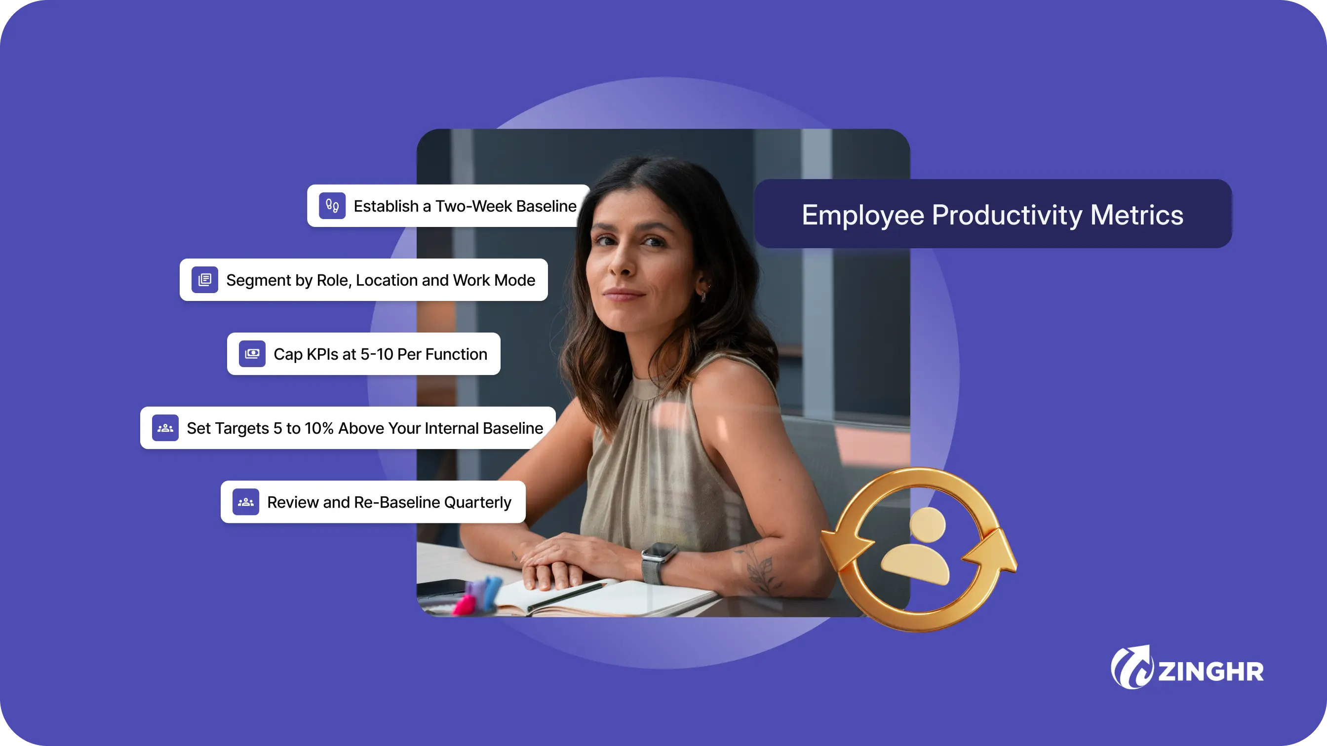
Table of contents
One unstitched HR platform to manage your entire workforce, from Hire to Re-Hire.
Talent Management solutions built for growing and exceptional people
Built-in compliance tools that update with changing regulations
Automated payroll, attendance, and leave management
Insights that help HR leaders make faster, better decisions

Key Takeaways
- Employee productivity metrics show how efficiently your people turn time and effort into business outcomes. At enterprise scale, the move that matters is shifting from vanity metrics like hours logged to value metrics like output and impact.
- Single-metric approaches fail across 1,000+ employees spanning multiple functions and hybrid work modes. Multi-dimensional scorecards give you a truer read.
- Sort your metrics into five categories: time and utilization, output and efficiency, quality and impact, engagement-linked signals and collaboration.
- Run a repeatable five-step framework. Baseline, segment, set aligned KPIs, embed them in your HCM and review quarterly.
- Agentic intelligence and compliance-ready governance under Digital Personal Data Protection Act (DPDPA) and the General Data Protection Regulation (GDPR) now count as table stakes for enterprise-grade productivity measurement.
Companies typically know their revenue per employee. However, far fewer know whether the hours behind that number went toward the work that generated the revenue, or toward status updates, approval chains, and meetings to schedule more meetings.
That gap has a measurable price: disengaged employees cost the global economy USD 438 billion in lost productivity in 2024. By 2025, Gallup's updated data puts the annual figure at USD 10 trillion.
This guide covers:
- What employee productivity metrics really are and the five categories worth measuring, with formulas and examples
- A five-step framework to operationalise them at scale
- The compliance guardrails you must clear in India and globally
- How ZingHR turns all of it into decisions instead of dashboards
What Are Employee Productivity Metrics?
Employee productivity metrics measure how efficiently people convert time, cost, and effort into business output. The core ratio is output divided by input.
Organisations usually default to tracking input because it is easier; hours logged, logins recorded, screens active. The problem is that input tells you how long people were at their desks, and output tells you what the business got for the salary it paid. Three terms that regularly get conflated in this space:
- Output: What got done (calls made, code merged, reports submitted).
- Outcome: What changed because of it (deal closed, bug resolved, decision made).
- Impact: Whether that outcome moved a business result (revenue generated, churn prevented, cost reduced).
Productivity metrics sit at the output layer. The stronger ones connect to outcomes, while the ones worth building dashboards around connect to impact.
1. Output vs. Input
A developer who spends six hours debugging a broken deployment pipeline and a developer who ships four production features in the same six hours will produce identical time-tracking data.
The salary cost is identical, but the business value is not. The productive-time ratio, active work hours divided by scheduled hours, gives you a more honest reading than login duration.
For most roles, the expected range sits at 60 to 75% of scheduled hours. Readings significantly above that typically reflect presence tracking rather than output tracking, because sustained focus research does not support higher figures in practice.
2. Vanity Metrics vs. Value Metrics
Vanity metrics are easy to collect, like login times, activity scores and messages sent. Value metrics answer a harder question: how much did this person's work contribute to a business result? Emails sent is a vanity metric. Close rate is a value metric.
Both are easy to pull from a CRM, but only one tells you whether the sales rep's time generated revenue. The distinction matters when setting targets, because a vanity metric target gives people something to game. A value metric target gives them something to deliver.
Why Single-Metric Approaches Fail at Scale
A one-number approach to productivity breaks the moment your workforce spans more than one function. Two specific failure modes show up consistently in large organisations.
1. One-Size Targets and Role Diversity
A sales representative and a backend engineer produce fundamentally different outputs on different cadences. A uniform task completion target applied to both mismeasures both.
Microsoft's 2025 Work Trend Index, based on survey data from 31,000 workers across 31 countries, found that 48% of employees describe their work as chaotic and fragmented. Remote and on-site employees show different focus-time patterns. Averaging across those groups produces a number that accurately describes nobody in the workforce.
2. "Work About Work" and the 60% Problem
Asana's Anatomy of Work Index found that knowledge workers spend 60% of their working time on "work about work". For instance, chasing status updates, sitting in unnecessary meetings and switching between tools to reconstruct context.
The average worker loses 103 hours per year to unnecessary meetings and spends a further 352 hours annually just talking about work rather than doing it. Counting those hours as productive time inflates the productivity score and obscures the structural problem underneath it.
The 5 Categories of Employee Productivity Metrics (With Formulas)
A scorecard across five categories gives you what a single metric cannot. Each category answers a different question about how work moves through your organisation:
1. Time and Utilisation Metrics
These metrics show how scheduled hours convert into actual work. A meeting-to-focus ratio above 1.0 means the team spends more time in meetings than doing the work those meetings are meant to coordinate.
A sales team running a 1.4 meeting-to-focus ratio is spending 40% more time on internal coordination than on selling; a scheduling and workflow problem that time-tracking data is the only way to surface before it shows up in missed quota.
Time and utilisation employee productivity metrics
2. Output and Efficiency Metrics
These metrics pair volume with throughput and connect directly to what finance already tracks.
Revenue per employee is the one that travels to board decks because it frames workforce output in terms the CFO already understands.
Industry context is essential here. NYU Stern's January 2026 analysis of 90+ U.S. sectors puts the cross-industry average at approximately USD 111,000 per employee, with entertainment software at USD 1.76 million at the top and hospitals far below the mean. Use your sector cohort as the reference point.
Output and efficiency employee productivity metrics
3. Quality and Impact Metrics
A support agent who closes 40 tickets per day with a 40% reopen rate generates more downstream rework than throughput. At 40 tickets closed and 16 reopened, the team is processing 56 tickets for every 40 the agent appears to complete in the daily count.
Tracking resolution per hour alongside reopen rate makes that arithmetic visible in the same dashboard row before it compounds across the week.
Quality and impact employee productivity metrics
4. Engagement-Linked Metrics
Gallup's data shows global employee engagement dropped to 20% in 2025, with the economic cost now estimated at USD 10 trillion annually. These metrics act as leading indicators. A team's eNPS falling from +18 to +4 over two quarters signals something about output and attrition before either data point confirms it.
The Burnout Signal Index is constructed by combining overtime hours, high-workload flags, and low-engagement survey signals. Watch the trend across a quarter rather than a single-week snapshot.
Engagement-linked productivity metrics
5. Team and Collaboration Metrics
When a development team hits individual story point targets each sprint but releases slip by two weeks, the missing variable is usually communication load and cross-functional blocking.
Network density measures how broadly people interact across the organisation. An engineer with a network density score of 2 (interacting with only two other teams) on a platform integration project is almost certainly a bottleneck.
Communication volume and channel split shows whether team members are spending disproportionate time in async communication relative to the time available for actual work.
Employee Productivity Metrics Examples by Role
The five categories above apply across every function, but the specific employee productivity metrics examples change by role type. The table below maps each role to its primary output, quality, and efficiency metrics.
Role-based output, quality, and efficiency metrics
1. Sales Representatives
Sales productivity falls apart when it is measured on output volume alone. A rep closing 12 deals per month with an average deal size of INR 80,000 and a 15% 90-day churn rate is generating less retained revenue than a rep who closes 8 deals at INR 1,20,000 with 5% churn.
Track close rate and average deal size together, and cross-reference against account churn on each rep's closed portfolio. The pipeline-to-close ratio, total pipeline value divided by closed revenue for the period, shows whether a rep is advancing strong deals or advancing everything and hoping something lands.
2. Software Developers
Story points completed is a partial view. Cycle time, the number of days from when a task enters active development to when it ships to production, tells you how fast work moves through the pipeline.
A developer averaging 3-day cycle time on medium-complexity tasks is producing faster than one averaging 9 days on the same task category, regardless of what either scores in a sprint review.
Defect rate per release grounds that speed in quality: cycle time falling while defect rate rises means the speed is coming from shortcuts in testing, and those shortcuts will show up as incidents in the next sprint.
3. Customer Support Agents
Tickets resolved per hour is a useful throughput number but a misleading productivity number on its own. First-contact resolution rate, the percentage of tickets fully resolved in a single interaction without a follow-up or reopen, is the quality corrective.
A team average of 65% FCR means 35% of tickets require at least one additional interaction, multiplying the real cost of each close. Track FCR at the agent level alongside the aggregate reopen rate; a consistent gap between the two at individual level identifies coaching needs faster than any survey can.
4. HR Managers
HR productivity is often measured on process volume, like requisitions filled and headcount targets hit. without a quality check attached. New-hire 90-day retention rate is that quality check. A team filling 40 positions per quarter with a 70% 90-day retention rate is spending significantly more in replacement costs than one filling 30 positions at 92% retention.
Pair time to fill with cost per hire and 90-day retention, and you have a three-metric view of whether the hiring process is producing durable results or high-volume turnover with a recruiting label on it.
How to Measure Employee Productivity: A 5-Step Framework
Knowing which metrics to measure employee productivity is half the problem. The other half is how you collect, segment, and act on those metrics at scale without producing a dashboard that nobody reads because it leads nowhere actionable.
Step 1: Establish a Two-Week Baseline
Pull two weeks of undisturbed data before changing anything. Collect productive-time ratio from attendance and project management systems. Capture average meeting hours per role family. Pull task completion rates from your project management tool.
Two weeks gives enough data to establish a usable baseline without seasonal distortion. Targets set without a baseline will be wrong for most of your workforce because averages hide the distribution, and most employees are not average.
Step 2: Segment by Role, Location and Work Mode
Read the segmented data before reading the aggregate. A company-wide productive-time ratio of 68% might conceal a 55% ratio in one delivery centre and an 81% ratio in a remote-first team. The 68% triggers no action. The 55% triggers an immediate conversation about meeting load and workflow structure in that specific location.
Segment by role family, on-site vs. remote, and reporting manager before drawing conclusions from any number.
Step 3: Cap KPIs at 5-10 Per Function
For each function, select the KPIs that map directly to revenue, cost, risk, or employee experience. 5-10 per function is the right ceiling. A sales function needs close rate, revenue per rep, and pipeline-to-close ratio. An engineering function needs cycle time, defect rate, and PR throughput.
Any metric that cannot connect to one of those four business outcomes belongs in a monitoring log, not a leadership review dashboard.
Step 4: Set Targets 5 to 10% Above Your Internal Baseline
Industry averages reflect a blended mix of company sizes, geographies, and business models that almost certainly does not match yours. Your own two-week baseline is the accurate reference point. Set improvement targets 5 to 10% above that baseline per role family.
Best-in-class targets drawn from benchmark reports invite gaming. Marginal-improvement targets above an employee's actual baseline invite genuine behavioural change.
Step 5: Review and Re-Baseline Quarterly
Productivity numbers shift with headcount changes, seasonal patterns, and organisational restructures. Re-baseline each quarter to account for those shifts. Watch voluntary attrition alongside output: if output rises while people leave, the productivity number is masking a workload or management problem.
ZingHR's analysis of how engagement and attrition connect at the team level covers this pattern in detail.
How ZingHR Tracks and Acts on Productivity Metrics
Organisations have data that sits in four separate systems. Attendance in one, performance goals in another, payroll in a third, engagement in a fourth. A CHRO trying to understand why one delivery centre is underperforming needs all four simultaneously.
Pulling them manually takes days and produces a snapshot rather than a live view.
1. Unified View of Time, Performance and Engagement Data
ZingHR consolidates time tracking, performance management, payroll, and employee engagement data in one platform.
Role-specific dashboards segment output, cost, and engagement signals by location and business unit so HR and finance read from the same numbers. ZingHR also connects via API with specialist monitoring tools like Teramind and ActivTrak, so organisations already running activity-tracking software feed that data into the same unified view.
2. Continuous Monitoring and Agentic Interventions
Ghrowth.ai, ZingHR's agentic intelligence layer, monitors metrics continuously rather than waiting for a monthly reporting cycle. Specific actions it can trigger:
- Learning recommendations for employees whose goal completion rates drop below their personal baseline.
- HRBP alerts when voluntary attrition risk spikes in a specific location or function.
- Manager nudges when team-level output metrics diverge from the team's own norm for more than two consecutive weeks.
- Real-time HR analytics dashboards surfacing productivity and engagement signals in one view for CHROs and CFOs.
For more on how this connects across the full employee lifecycle, see ZingHR's guide to the employee productivity ecosystem.
Track the Metric That Connects to a Decision
Revenue per employee that nobody cross-references against headcount decisions is a board slide. Revenue per employee that triggers a workforce planning conversation when it drops below a threshold for two consecutive quarters is a management tool.
The difference is whether the metric lives in a system that connects it to an action, or sits in a spreadsheet someone opens twice a year.
The five-category scorecard, the role-specific examples, and the five-step framework above give you the structure. What you do with the number after you read it is what determines whether any of it changes anything.
Book a demo to see how ZingHR's agentic intelligence HCM platform supports your productivity measurement strategy.
Frequently asked questions (FAQs)
Employee productivity metrics are quantitative measures of how efficiently employees convert time and effort into business output. They span five categories: time and utilisation, output and efficiency, quality and impact, engagement-linked signals and team collaboration metrics.
The strongest starting combination is productive-time ratio, task or project completion rate, revenue per employee, error or defect rate, and eNPS. Productive-time ratio and task completion rate cover output volume. Error rate keeps volume honest. Revenue per employee connects headcount to financial performance. eNPS is a 6-to-12-week leading indicator for output decline.
Sales: close rate, revenue per rep, pipeline-to-close ratio, and 90-day account churn. Engineering: cycle time, defect rate per release, and PR throughput per sprint. Customer support: first-contact resolution rate, tickets resolved per hour, reopen rate, and CSAT per agent. HR: time to fill, cost per hire, offer acceptance rate, and new-hire 90-day retention.
Measure completed outputs and their quality. Task completion rate, first-contact resolution rate, and revenue per rep all measure what the business received for the salary it paid. Combined with quality metrics like error rate and CSAT, they give a more accurate picture of productivity than any activity log. Transparency about what is being measured and why also matters. Employees who understand the measurement criteria perform against them honestly.
A unified HCM platform eliminates the reconciliation step that costs HR teams days each month by consolidating time, performance, payroll, and engagement data in one place. Agentic platforms like ZingHR go further. Ghrowth.ai flags productivity anomalies continuously, such as goal completion dropping in one team or a burnout signal clustering around one manager, and routes each flag to the right person before it escalates.
What to do next?
See ZingHR in Action
Join the 1,200+ enterprises that have replaced fragmented HR with one intelligent, future-ready platform. See ZingHR in 30 minutes.
Build the Organization You Want
Great HR drives retention, capability, and culture. ZingHR takes care of the operational layer so your people team owns the strategy.

Elevating Impact.
Defining Destiny
See how ZingHR's AI-powered Hire-to-ReHire platform frees your CPO to lead with purpose and deliver the outcomes your Board is watching for


ZingHR is the AI-powered Hire-to-ReHire platform built for one purpose to remove every transactional layer of HR from your organisation, permanently.